Dark mode has evolved from a trendy feature to an essential part of modern app design. This comprehensive guide will walk you through implementing a robust, persistent dark mode system in Flutter with best practices and advanced features.
Why Dark Mode Matters
User Benefits
- Reduced Eye Strain: Lower blue light emission and reduced brightness help prevent digital eye fatigue
- Enhanced Battery Life: OLED displays consume up to 60% less power when displaying dark pixels
- Improved Accessibility: Better contrast options for users with visual sensitivities
- Contextual Comfort: Ideal for low-light environments and nighttime usage
Developer Benefits
- Modern UI Standards: Meets user expectations for contemporary app design
- System Integration: Seamless integration with device-wide theme preferences
- Brand Differentiation: Opportunity to create unique visual experiences
Understanding Flutter’s Theme System
Flutter’s theming revolves around three key components:
ThemeData
Defines the visual properties of your app including colors, typography, and component styles.
ThemeMode
Controls which theme is active:
ThemeMode.system– Follows device settings (recommended default)ThemeMode.light– Forces light themeThemeMode.dark– Forces dark theme
Material Design 3
Flutter’s latest Material Design implementation provides enhanced support for dynamic theming and better dark mode defaults.
Complete Implementation
1. Project Setup
First, add the required dependencies to your pubspec.yaml:
dependencies:
  flutter:
    sdk: flutter
  shared_preferences: ^2.2.2
  provider: ^6.0.5

dev_dependencies:
  flutter_test:
    sdk: flutter
  flutter_lints: ^2.0.0
2. Theme Configuration
Create a dedicated theme configuration file (lib/theme/app_theme.dart):
import 'package:flutter/material.dart';

class AppTheme {
  // Brand colors
  static const Color primaryLight = Color(0xFF1976D2);
  static const Color primaryDark = Color(0xFF90CAF9);
  static const Color surfaceLight = Color(0xFFFAFAFA);
  static const Color surfaceDark = Color(0xFF121212);

  // Light theme
  static ThemeData get lightTheme {
    return ThemeData(
      useMaterial3: true,
      brightness: Brightness.light,
      colorScheme: ColorScheme.fromSeed(
        seedColor: primaryLight,
        brightness: Brightness.light,
      ),
      appBarTheme: const AppBarTheme(
        centerTitle: true,
        elevation: 0,
        scrolledUnderElevation: 1,
      ),
      cardTheme: CardTheme(
        elevation: 2,
        shape: RoundedRectangleBorder(
          borderRadius: BorderRadius.circular(12),
        ),
      ),
      elevatedButtonTheme: ElevatedButtonThemeData(
        style: ElevatedButton.styleFrom(
          padding: const EdgeInsets.symmetric(horizontal: 24, vertical: 12),
          shape: RoundedRectangleBorder(
            borderRadius: BorderRadius.circular(8),
          ),
        ),
      ),
    );
  }

  // Dark theme
  static ThemeData get darkTheme {
    return ThemeData(
      useMaterial3: true,
      brightness: Brightness.dark,
      colorScheme: ColorScheme.fromSeed(
        seedColor: primaryDark,
        brightness: Brightness.dark,
      ),
      appBarTheme: const AppBarTheme(
        centerTitle: true,
        elevation: 0,
        scrolledUnderElevation: 1,
      ),
      cardTheme: CardTheme(
        elevation: 2,
        shape: RoundedRectangleBorder(
          borderRadius: BorderRadius.circular(12),
        ),
      ),
      elevatedButtonTheme: ElevatedButtonThemeData(
        style: ElevatedButton.styleFrom(
          padding: const EdgeInsets.symmetric(horizontal: 24, vertical: 12),
          shape: RoundedRectangleBorder(
            borderRadius: BorderRadius.circular(8),
          ),
        ),
      ),
    );
  }
}
3. Theme Provider (State Management)
Create a theme provider (lib/providers/theme_provider.dart):
import 'package:flutter/material.dart';
import 'package:shared_preferences/shared_preferences.dart';

class ThemeProvider with ChangeNotifier {
  static const String _themeKey = 'theme_mode';
  ThemeMode _themeMode = ThemeMode.system;

  ThemeMode get themeMode => _themeMode;

  bool get isDarkMode {
    if (_themeMode == ThemeMode.system) {
      return WidgetsBinding.instance.platformDispatcher.platformBrightness ==
             Brightness.dark;
    }
    return _themeMode == ThemeMode.dark;
  }

  String get currentThemeName {
    switch (_themeMode) {
      case ThemeMode.light:
        return 'Light';
      case ThemeMode.dark:
        return 'Dark';
      case ThemeMode.system:
        return 'System';
    }
  }

  ThemeProvider() {
    _loadThemeMode();
  }

  /// Load saved theme preference
  Future<void> _loadThemeMode() async {
    final prefs = await SharedPreferences.getInstance();
    final themeIndex = prefs.getInt(_themeKey) ?? 0;
    _themeMode = ThemeMode.values[themeIndex];
    notifyListeners();
  }

  /// Save theme preference
  Future<void> _saveThemeMode() async {
    final prefs = await SharedPreferences.getInstance();
    await prefs.setInt(_themeKey, _themeMode.index);
  }

  /// Set theme mode
  Future<void> setThemeMode(ThemeMode mode) async {
    if (_themeMode == mode) return;

    _themeMode = mode;
    notifyListeners();
    await _saveThemeMode();
  }

  /// Toggle between light and dark (ignores system)
  Future<void> toggleTheme() async {
    if (_themeMode == ThemeMode.light) {
      await setThemeMode(ThemeMode.dark);
    } else {
      await setThemeMode(ThemeMode.light);
    }
  }
}
4. Main Application Setup
Update your lib/main.dart:
import 'package:flutter/material.dart';
import 'package:provider/provider.dart';
import 'package:your_app/providers/theme_provider.dart';
import 'package:your_app/theme/app_theme.dart';
import 'package:your_app/screens/home_screen.dart';

void main() {
  runApp(
    ChangeNotifierProvider(
      create: (context) => ThemeProvider(),
      child: const MyApp(),
    ),
  );
}

class MyApp extends StatelessWidget {
  const MyApp({super.key});

  @override
  Widget build(BuildContext context) {
    return Consumer<ThemeProvider>(
      builder: (context, themeProvider, child) {
        return MaterialApp(
          title: 'Dark Mode Demo',
          debugShowCheckedModeBanner: false,
          theme: AppTheme.lightTheme,
          darkTheme: AppTheme.darkTheme,
          themeMode: themeProvider.themeMode,
          home: const HomeScreen(),
        );
      },
    );
  }
}
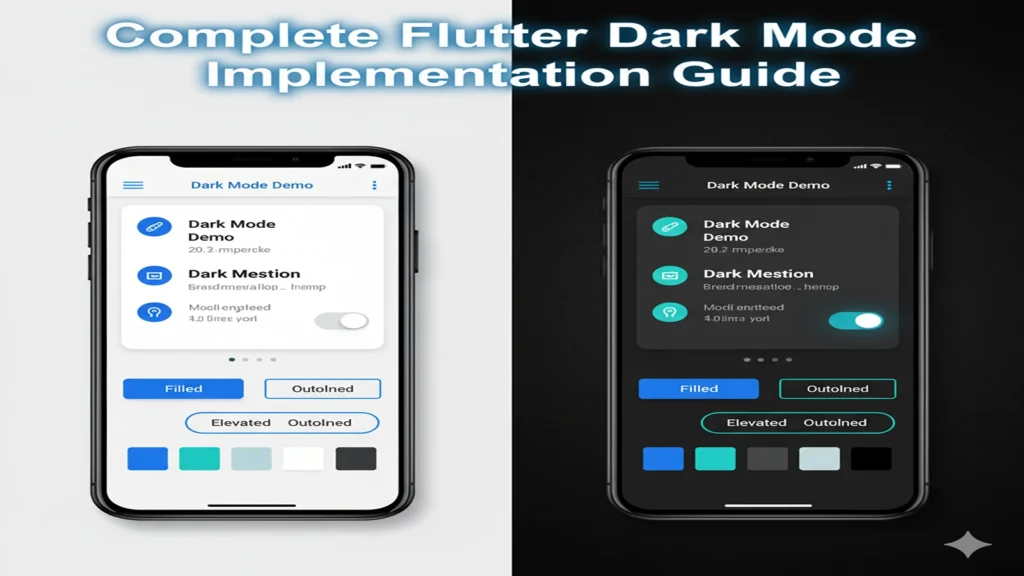
5. Enhanced Home Screen
Create an improved home screen (lib/screens/home_screen.dart):
import 'package:flutter/material.dart';
import 'package:provider/provider.dart';
import 'package:your_app/providers/theme_provider.dart';
import 'package:your_app/widgets/theme_selector_dialog.dart';

class HomeScreen extends StatelessWidget {
  const HomeScreen({super.key});

  @override
  Widget build(BuildContext context) {
    return Scaffold(
      appBar: AppBar(
        title: const Text('Dark Mode Demo'),
        actions: [
          IconButton(
            icon: const Icon(Icons.palette_outlined),
            onPressed: () => _showThemeSelector(context),
            tooltip: 'Change Theme',
          ),
        ],
      ),
      body: Consumer<ThemeProvider>(
        builder: (context, themeProvider, child) {
          return SingleChildScrollView(
            padding: const EdgeInsets.all(16.0),
            child: Column(
              crossAxisAlignment: CrossAxisAlignment.start,
              children: [
                // Theme Status Card
                Card(
                  child: Padding(
                    padding: const EdgeInsets.all(16.0),
                    child: Column(
                      crossAxisAlignment: CrossAxisAlignment.start,
                      children: [
                        Row(
                          children: [
                            Icon(
                              themeProvider.isDarkMode
                                ? Icons.dark_mode
                                : Icons.light_mode,
                              color: Theme.of(context).colorScheme.primary,
                            ),
                            const SizedBox(width: 8),
                            Text(
                              'Current Theme',
                              style: Theme.of(context).textTheme.titleMedium,
                            ),
                          ],
                        ),
                        const SizedBox(height: 8),
                        Text(
                          themeProvider.currentThemeName,
                          style: Theme.of(context).textTheme.headlineSmall?.copyWith(
                            color: Theme.of(context).colorScheme.primary,
                            fontWeight: FontWeight.bold,
                          ),
                        ),
                        if (themeProvider.themeMode == ThemeMode.system)
                          Text(
                            'Following ${themeProvider.isDarkMode ? 'dark' : 'light'} system setting',
                            style: Theme.of(context).textTheme.bodySmall,
                          ),
                      ],
                    ),
                  ),
                ),

                const SizedBox(height: 16),

                // Quick Toggle
                Card(
                  child: SwitchListTile.adaptive(
                    title: const Text('Dark Mode'),
                    subtitle: const Text('Toggle between light and dark themes'),
                    value: themeProvider.isDarkMode,
                    onChanged: themeProvider.themeMode == ThemeMode.system
                      ? null
                      : (value) => themeProvider.toggleTheme(),
                    secondary: Icon(
                      themeProvider.isDarkMode
                        ? Icons.dark_mode
                        : Icons.light_mode,
                    ),
                  ),
                ),

                const SizedBox(height: 24),

                // Sample UI Elements
                Text(
                  'Sample UI Elements',
                  style: Theme.of(context).textTheme.headlineSmall,
                ),

                const SizedBox(height: 16),

                // Buttons Row
                Row(
                  mainAxisAlignment: MainAxisAlignment.spaceEvenly,
                  children: [
                    ElevatedButton(
                      onPressed: () {},
                      child: const Text('Elevated'),
                    ),
                    FilledButton(
                      onPressed: () {},
                      child: const Text('Filled'),
                    ),
                    OutlinedButton(
                      onPressed: () {},
                      child: const Text('Outlined'),
                    ),
                  ],
                ),

                const SizedBox(height: 16),

                // Color Palette Preview
                Card(
                  child: Padding(
                    padding: const EdgeInsets.all(16.0),
                    child: Column(
                      crossAxisAlignment: CrossAxisAlignment.start,
                      children: [
                        Text(
                          'Color Palette',
                          style: Theme.of(context).textTheme.titleMedium,
                        ),
                        const SizedBox(height: 12),
                        _buildColorRow(
                          context,
                          'Primary',
                          Theme.of(context).colorScheme.primary,
                        ),
                        _buildColorRow(
                          context,
                          'Secondary',
                          Theme.of(context).colorScheme.secondary,
                        ),
                        _buildColorRow(
                          context,
                          'Surface',
                          Theme.of(context).colorScheme.surface,
                        ),
                        _buildColorRow(
                          context,
                          'Background',
                          Theme.of(context).colorScheme.background,
                        ),
                      ],
                    ),
                  ),
                ),
              ],
            ),
          );
        },
      ),
      floatingActionButton: FloatingActionButton(
        onPressed: () => _showThemeSelector(context),
        tooltip: 'Theme Settings',
        child: const Icon(Icons.palette),
      ),
    );
  }

  Widget _buildColorRow(BuildContext context, String name, Color color) {
    return Padding(
      padding: const EdgeInsets.symmetric(vertical: 4.0),
      child: Row(
        children: [
          Container(
            width: 24,
            height: 24,
            decoration: BoxDecoration(
              color: color,
              borderRadius: BorderRadius.circular(4),
              border: Border.all(
                color: Theme.of(context).dividerColor,
                width: 0.5,
              ),
            ),
          ),
          const SizedBox(width: 12),
          Expanded(child: Text(name)),
          Text(
            '#${color.value.toRadixString(16).substring(2).toUpperCase()}',
            style: Theme.of(context).textTheme.bodySmall?.copyWith(
              fontFamily: 'monospace',
            ),
          ),
        ],
      ),
    );
  }

  void _showThemeSelector(BuildContext context) {
    showDialog(
      context: context,
      builder: (context) => const ThemeSelectorDialog(),
    );
  }
}
6. Theme Selector Dialog
Create a theme selector widget (lib/widgets/theme_selector_dialog.dart):
import 'package:flutter/material.dart';
import 'package:provider/provider.dart';
import 'package:your_app/providers/theme_provider.dart';

class ThemeSelectorDialog extends StatelessWidget {
  const ThemeSelectorDialog({super.key});

  @override
  Widget build(BuildContext context) {
    return Consumer<ThemeProvider>(
      builder: (context, themeProvider, child) {
        return AlertDialog(
          title: const Text('Choose Theme'),
          content: Column(
            mainAxisSize: MainAxisSize.min,
            children: [
              _buildThemeOption(
                context,
                'System Default',
                'Follow device settings',
                Icons.settings_suggest,
                ThemeMode.system,
                themeProvider.themeMode,
                themeProvider.setThemeMode,
              ),
              _buildThemeOption(
                context,
                'Light Mode',
                'Always use light theme',
                Icons.light_mode,
                ThemeMode.light,
                themeProvider.themeMode,
                themeProvider.setThemeMode,
              ),
              _buildThemeOption(
                context,
                'Dark Mode',
                'Always use dark theme',
                Icons.dark_mode,
                ThemeMode.dark,
                themeProvider.themeMode,
                themeProvider.setThemeMode,
              ),
            ],
          ),
          actions: [
            TextButton(
              onPressed: () => Navigator.of(context).pop(),
              child: const Text('Close'),
            ),
          ],
        );
      },
    );
  }

  Widget _buildThemeOption(
    BuildContext context,
    String title,
    String subtitle,
    IconData icon,
    ThemeMode mode,
    ThemeMode currentMode,
    Function(ThemeMode) onChanged,
  ) {
    final isSelected = mode == currentMode;

    return RadioListTile<ThemeMode>(
      title: Text(title),
      subtitle: Text(subtitle),
      secondary: Icon(
        icon,
        color: isSelected
          ? Theme.of(context).colorScheme.primary
          : null,
      ),
      value: mode,
      groupValue: currentMode,
      onChanged: (value) {
        if (value != null) {
          onChanged(value);
          Navigator.of(context).pop();
        }
      },
    );
  }
}
Advanced Features
System Theme Detection
The implementation automatically detects and responds to system-wide theme changes when ThemeMode.system is selected.
Persistent Preferences
Theme preferences are saved locally and restored when the app restarts, providing a seamless user experience.
Smooth Transitions
Flutter automatically handles smooth transitions between themes, including animated color changes.
Accessibility Considerations
- High contrast ratios for better readability
- Proper semantic labeling for screen readers
- Adaptive controls that work well in both themes
Best Practices
- Use Material Design 3: Leverage
useMaterial3: truefor better theming defaults - Test Both Themes: Ensure all UI elements look good in both light and dark modes
- Consider Brand Colors: Adapt your brand colors appropriately for each theme
- Performance: Use
Consumerwidgets to minimize rebuilds - User Choice: Always provide easy access to theme switching options
Customization Ideas
- Multiple Color Schemes: Add support for different color palettes
- Scheduled Themes: Automatically switch themes based on time of day
- Custom Themes: Allow users to create their own color combinations
- Theme Animations: Add custom transition animations between themes
Conclusion
This comprehensive implementation provides a solid foundation for dark mode in your Flutter applications. The modular approach makes it easy to extend and customize while following Flutter best practices for state management and theming.
The combination of Provider for state management, SharedPreferences for persistence, and Material Design 3 for modern theming creates a robust and user-friendly dark mode system that your users will appreciate.
Remember to test your implementation across different devices and screen sizes to ensure a consistent experience for all users.